Case Study · Elevance Health · Design Systems · Feb 2026 — Ongoing
Enterprise Design System
Token-Driven, Brand-Agnostic, Fully Responsive Component Design
A primitive-, semantic- and brand-token architecture that unifies design and code across Elevance Health's growing portfolio of brands — enabling faster brand onboarding, 1:1 design-to-code parity and consistent, accessible user experiences at scale.
Role
UX Lead Designer
Duration
Feb 2026 — Ongoing
Scope
Tokens · Components · Theming
Team
Surya Teja + 3 Sr. Designers (Anthem & Elevance Health)
Overview
The context
As Elevance Health expands its portfolio — incorporating more brands and services under its umbrella — the organization faces growing challenges in maintaining consistency across design and codebase.
These issues stem from the complexity of managing multiple assets while ensuring a cohesive user experience and efficient turnaround times.
Establishing streamlined processes and scalable systems has become essential to address these challenges and support continued growth and innovation.
My Role
As UX Lead Designer, I led the definition and design of scalable component systems — establishing component properties, driving the creation of component-level tokens, and ensuring alignment with primitive and semantic tokens for consistency across the design system. I also guided design strategy, mentored team members, collaborated closely with product and engineering stakeholders, drove usability and accessibility standards, and ensured solutions aligned with both user needs and business goals.
The Vision
North star
Streamline the design and development process — enabling quicker turnaround times when adding new brands while ensuring a 1:1 alignment between design and development.
By introducing design tokens — centralized decisions that store visual properties — we enhance business goals and simultaneously deliver a superior experience for users.
Design Process
A Three-Layer Token Architecture
Layer 01
Primitive Tokens
The core building blocks of a scalable system — brand colors, spacing units, font sizes and border radius. Brand colors define identity, spacing maintains layout structure, font sizes ensure typographic clarity, and border radius shapes aesthetics. Together they create a unified, responsive foundation enabling visual consistency, easy updates and efficient collaboration across platforms.
Layer 02
Semantic Tokens
Represent UI elements based on their function and purpose rather than visual traits — e.g. button-primary-background, input-border-focus. This context-driven approach promotes consistency, flexibility, accessibility and easier maintenance — aligning design and development with user needs and product behavior.
Layer 03
Brand Tokens
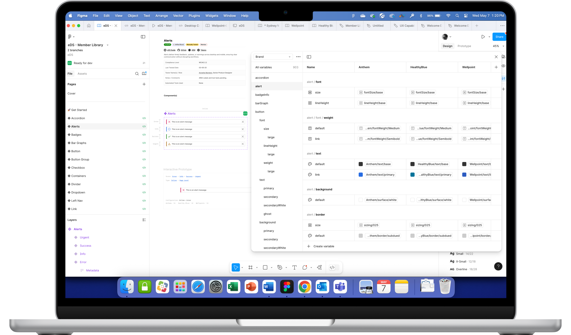
Tailored to a particular brand or component — brand-specific colors, typography, iconography and component states. In Figma, these tokens pair with modes to create dynamic components that adapt across light/dark or different brand variants — enabling reusable, flexible components that update centrally and reduce redundant work across brands and contexts.
Design ↔ Code Consistency
1:1 parity
Design tokens bridge the gap between design and development by providing a single source of truth for color, typography, spacing and border radius. They ensure a 1:1 translation from design to code, are language-agnostic and support consistency across platforms (CSS, JS, Swift, etc.). This unified system simplifies implementation, reduces discrepancies and scales easily.
Figma's developer tools enhance this connection — designers share up-to-date tokens, specs and assets directly with developers. A well-documented portal site with component guidelines, use cases and anatomy ensures developers have the context they need. Together, these tools streamline handoffs, align teams and help deliver designs accurately and efficiently.
Component Library
Components — Atomic & Composable
Component · Alerts
Token-driven status surfaces — success, warning, error, info. Theme- and brand-aware across all variants and states.
Component · Toggle
Fully accessible switch with motion, focus and state tokens — predictable across every brand mode.
Component · Bar Graph
Data-viz primitive built from semantic color and spacing tokens — re-themed automatically per brand.
Architecture
Main Components
Single source-of-truth components consumed across every brand. Properties, variants and states defined once — propagated everywhere.
Architecture
Sub Components
Composable building blocks of main components — independently maintained, ensuring atomic updates ripple cleanly through the system.
Conclusion
Outcomes & Learnings
1 SoT
Single source of truth across brands
1:1
Design ↔ code parity
Modes
Figma modes power brand theming
Scalable
Faster brand onboarding
This project marked the first time I fully leveraged Figma's local variables to their full potential — allowing for greater flexibility and consistency in our design system. By incorporating local variables, we were able to efficiently manage design tokens across multiple components, ensuring updates could be applied universally with ease.
This was a significant step forward in streamlining our workflow and reducing redundancy — centralized control over design values like colors, typography, spacing and border radius means design and engineering move in lockstep, and onboarding a new brand becomes a token swap rather than a full redesign.